HighCastle of Geek

​A blog/journal about my life and the stuff I like. Popular subjects include music, guitars, gear, books, movies, video games, technology, humor.

Filtering by Tag: home construction

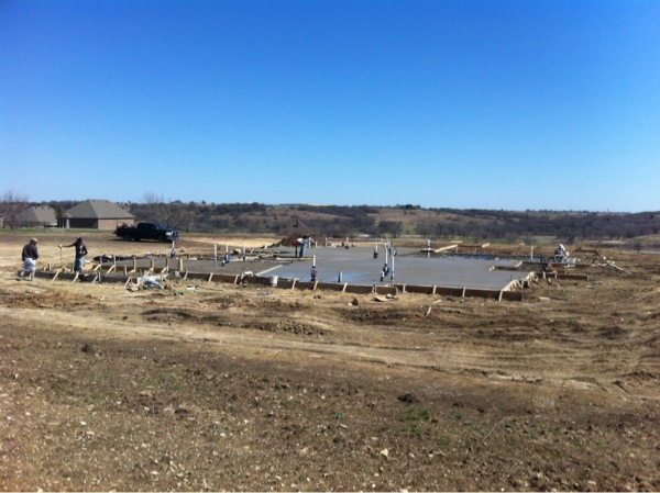
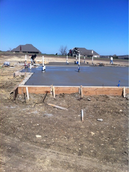
Foundation...

and empire? (that's a Heinlein reference, in case you were wondering.) (and you were). Read a book, sheesh.

Anywhat,

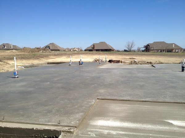
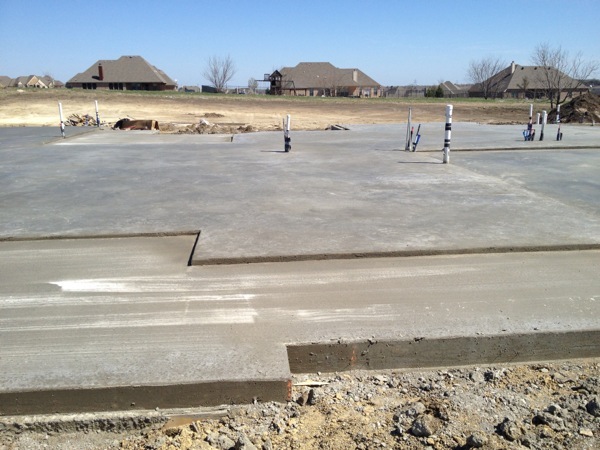
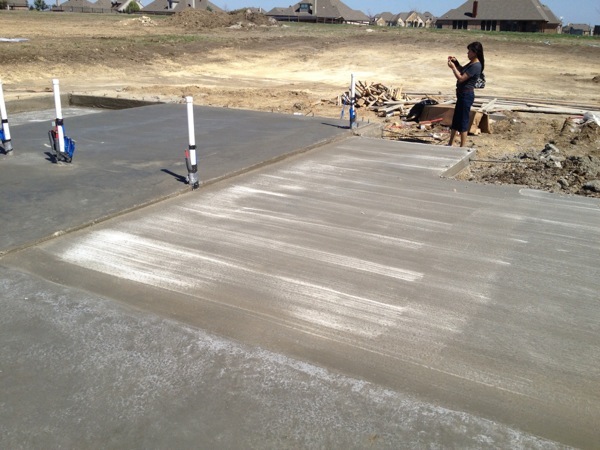
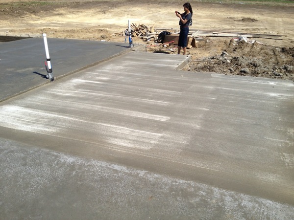
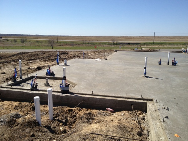
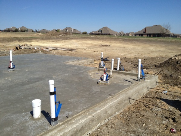
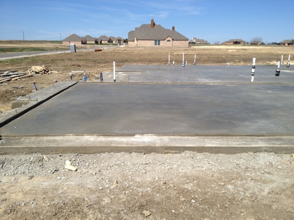
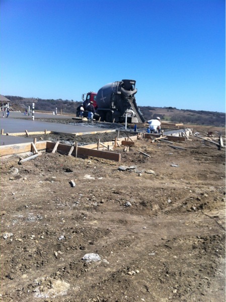
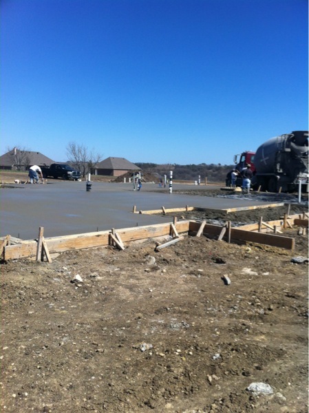
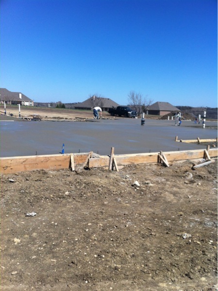
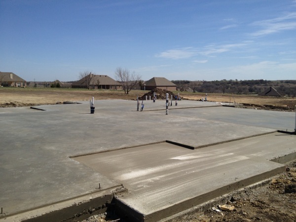
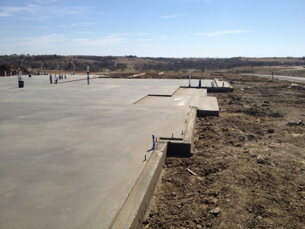
here are some more photos we took on Saturday after they finished.

Front porch/door.

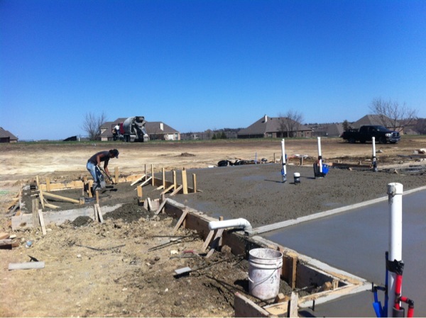
Looking down the front perimeter from the left side of the house.

From front door looking back left towards home theatre.

Front door looking towards back patio.

Left side with two guest bedrooms and bathroom looking towards home theatre.

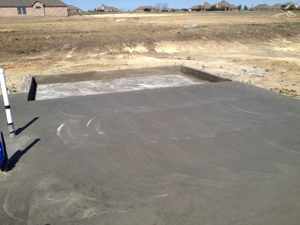
Home theatre with sunken front with the intent to create a modest stadium seat arrangement and hopefully get the center of mass of the screen down to eye level at the primary viewing position.

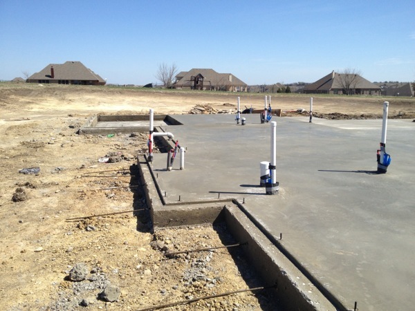
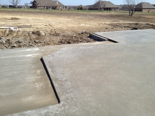
The next few shots are of the back patio which is outlined by the slightly lower margin. That back square is the spot for the fireplace and a current bone of contention. After seeing it in person, this doesn't look like it will adequately accommodate the fireplace I envisioned, so I'm asking the builder what we can do to include extending the slab portion across to the depth of the solitary square. I want to have some low brick or stone walls on the right side for seating and possibly a slot for firewood storage. 

As you can see above, by extending the length of the kitchen, we essentially lost porch space outside the breakfast bar area. If we extend the slab out even with the fireplace square, we should have some usable porch area on that side as well. 

The two pictures above show the master bath/shower. 

Garage.


Finishes

Above are the countertop choices. The top left granite with the red flecks and copperish streak will be the kitchen countertops. On the right the slightly darker flecked granite that continues the copper color will be all the other countertops in the bathrooms, home theater, and outdoor kitchen. The white sample on the bottom is cultured marble that will be used only in the laundry room. We managed to get colors we were happy with within our allowable choices.


The stone tile above will be for the kitchen backsplash. We're going to use the darker tiles on top in the larger size with the lighter color in the bottom picture for smaller tiles so it will be sort of the accent color. Many of our finish choices are lighter since the cabinets and hardwood floors will be darker.

I'm also looking at getting a custom painted set of tiles for behind the cooktop. We're trying to see if we can get this asian floral/tree pattern that has similar colors to the countertops and would look nice and understated. We have to see if the company in question will expand the image across multiple tiles.

The Gold tiles (not to scale) are the choice for the bathroom floors and wall/shower tiles. These are ceramic (or maybe porcelain?) but they have a variety of textures as seen above to give them more of a stone feel.

That very descriptive and interesting picture above is the wall color. We ended up settling on a fairly neutral beige that is really similar to the wall colors in our last two houses, but it's a compromise that's unavoidable when you start considering the other colors and the need for some contrast so we're not overwhelmed by dark colors.

The chateau brown (as used in chateaus, apparently) is the choice for the home theater walls. We were given two paint color choices and we could have used them however we wanted, but we decided to go with beige in every other room. It's all flat paint, not counting trim colors. The home theater walls needed to be a bit darker to absorb reflections.

The 3 pictures above show the hardware. This is a pretty standard material & color in home construction now, it's almost identical to what we had in our first Carothers home in Killeen. We like the color & material both, so why fix what isn't broken.

We had multiple options for the interior doors but we ended up liking what Royal Crest had in their office so we chose that, as well as the trim colors.

The old world texture on the right (not the color) is an option for two rooms in the home where they will go ahead and manually apply the texture when painting. We chose the two biggest rooms, the living room and home theater.

We didn't find the specific door we wanted. The two doors above represent what we hope to combine. The door on the left is a bit too "prison doory" to use Aeyong's real estate jargon, and I agreed. The door on the right's glass insert was bigger than we wanted. We're asking RC to give us the door on the left with the upper pane all glass so we have a half door sized glass insert (with a pattern to be chosen later). We really like how the wooden planks in the door evoke the hardwood floors we hope to get. That's another finish you won't see yet, because we're trying to find out if it will cost us more for our preference. We were quoted for scrubbed hardwood floors in the office, dining (library), and living room, but that was for 3 inch planks. We definitely prefer the 5 inch, so we're going to try and get them to change to those. We originally envisioned those being a really dark stain, but we're starting to think a little less stain will be preferable since we have dark furniture.

Yes, we actually got to choose the roof color. We went wild and chose the weathered wood, which is apparently what every other home in Mustang Creek already has (or close to it). We just couldn't see having some bizarre roof color that would call attention to itself. We figured the pink elephants and flamingoes next to the car on blocks would take care of that.
Blueprints discussed

We met with them yesterday (a day later than planned thanks to a long day at work courtesy of our perennially absent examiner, no names mentioned), and went through the blueprints and discussed our changes. They seemed surprised by the home theater dimensions but we were able to show them we requested 15x25 on the original documents, so they're going to fix that. We are waiting for an estimate on the cost of the bar, but they predicted it could be done for around $3K, so that's definitely worth it for us. We were able to move some lights around as they had recessed lights in several places that we didn't really care about so we changed four of them for in the home theater. We also got them to agree to install an equipment shelf on the left wall of the theater that will open up to the guest room closet and give me access to my a/v rack from behind. That should eliminate the frustration of installation and upgrades to my a/v gear in the future.

We made a few other modifications here and there but it's fairly close to what we originally requested. They predicted 10 days to get the blueprints back, so that means they'll probably not break ground until the first week or so of February. That will push us into an August completion and most likely a September closing date. Maybe they'll be able to build faster than predicted, but I'm not holding my breath. We will be having ongoing meetings with them to choose cabinets, counters, and other finishes and colors. It's nice to be involved in each step, but we always have the feeling we're missing something critical. We at least have the experience of our first house to know a little better about our preferences.

No house can be perfect because there will always be little tweaks and changes you want to make, but this house is shaping up to be really close to our ideal. This house gives us a slight case of deja vu because the front layout and kitchen area are really similar to our first home. The foyer, office, dining room, and kitchen are almost identical with only a slight difference in kitchen design. The locations are all the same, so we get the same feeling walking in the front door of this house as we did in our first house. It's probably not that uncommon because there are only so many basic home designs among all builders. Things can get decidedly different with custom builders or in other countries, but in Texas at least, the home builders only have so many stock plans and they just make tweaks to separate themselves.

Hallo there...

Not much new happening here in strumville. We did go ahead and sign the build contract and we're moving forward with the home in Mustang Creek. We've done the preliminary design and we meet with them tomorrow to see the blueprints, to which we're already going to make some tweaks. We asked for a 15x25 home theater (we now have a 13x20, and it's a decent size but needs a little more elbow and furniture room) and the blueprints are showing a 16x22 which is dangerously close to a bad ratio with the 10 foot high ceilings. I don't profess to really know what I'm talking about, but in acoustic room design you never want to have a size dimension that's half/double of one of the others. This creates standing sound waves which I think is equivalent to feedback which can be a serious detriment to good sound mixing. 19-21 feet is a no fly zone with the 10 foot ceilings, so we're going to insist on the 15x25 that we requested (the inner dimension, not the outer walls).

We're also asking them to add a bar to the rear of the home theater and I have a feeling that's going to add another $5K to the price at least, but if they can do it for that much, we'll get it done. We're hoping to make this home a true turnkey experience where we don't have any sense that we should change things substantially. There will always be tweaks over time, but we're hoping they'll mostly be cosmetic diy projects that we can handle and not major home renovations. We're hoping to get our dream home that we'll be satisfied with in the long run.